After many moons of plotting and scheming, yesterday we announced our organizational rebranding: The organization formerly known as The Open Planning Project (or TOPP) is now OpenPlans. I am excited, and I think this is a welcome development.
For years, there has been mass confusion (chaos! pandemonium!) around our name. Our emails were @openplans.org, our website was topp.openplans.org (until 2009), and our name was the Open Planning Project. To top it off, for several years, we ran a separate web service called OpenPlans (now under new management as CoActivate). As I've mentioned before, I've never been comfortable with these conflicting brands and identities, and I'm psyched that we've finally made the leap.
Here's a quick look into where we ended up, and how we got there.
First, we've updated our logo. Designed by the spectacularly fabulous Andy Cochran, it's similar to our old logo, but with cleaner lines and more meaning. It probably goes without saying, but we've got the "O" and the "P" in there, and the shape is a broken circle, evoking open processes:
For comparison, here's the logo that we'd been using for the past year or so. In order to minimize confusion between OpenPlans (the service) and The Open Planning Project the organization, we spent most of 2009 using our organizational nickname, TOPP, more prominently in our identity. While "TOPP" is easy to say and remember, as with most acronyms, it's pretty meaningless on its own. I'm sure it will take us a while to erase TOPP from our vocabularies, but I think it's the right move.
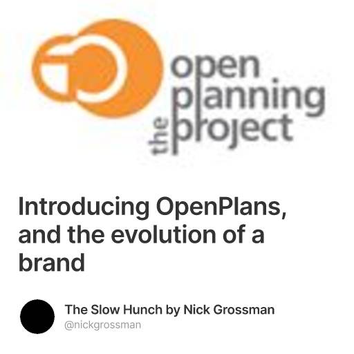
To round out the logo history, here's the one that was in service through 2008. I like it, however for the twenty- and thirty-somethings in the room, "OPP" means something a bit different (can you say "harm me with harmony"?).

Of course, to go along with the rebrand, we've updated the OpenPlans website, attempting to streamline our messaging along with our logo & brand. We've been struggling with a meaningful, succinct tagline for quite some time, and for now have settled on "We make cities work better." A while back, I wrote about the idea of "making cities easier to use" -- since then, we've taken that idea and adapted it a bit. Making cities work better is a better representation of our intentions, as it's multi-directional (i.e., we're not just "using" cities), and it hints at the digital infrastructure that we're building. Also, for the first time, I think we've successfully articulated how our software development, technology strategy and journalism activities are connected, as part of what we're calling "the new civic infrastructure." Lastly, a major goal of the redesign was to make it more clear what we do and how people can work with us. I guess now we just sit back and wait for the contracts to roll in... Here's what the website looks like today:

And for another trip on the Wayback Machine, here's a look at 2009:

2008:

and 2007:

That's it. Hello, OpenPlans. Nice to meet you.
- Loading comments...