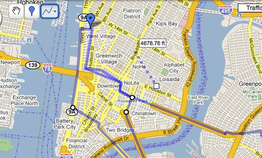
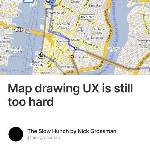
At work today, we are exploring the process of drawing routes on a map, thinking ahead to a few upcoming projects involving bike planning. So Sonali set up a Google MyMap and asked a few of us to mark our routes to work. In a nutshell, it was basically a flop, with two out of three people giving up before finishing. Paul Winkler summed up the process beautifully:
My internal dialog went something like: "okay, now my route is merging with Nick's ... oops, now i'm editing Nick's line by mistake, how do I undo that? (random clicking around) ... ok now i'm back to editing my line ... argh, it's going down the wrong street... let's try this way... whoa, why is there a random line floating around in the water? can't seem to get rid of that one... oops, didn't want to put a point there, let's see if i can delete it... click... oops, i apparently deleted all the work i just did on my line, and there doesn't seem to be an undo for that. F**k it."
It's tough UI to get right -- basically you're trying to replicate the vector drawing capabilities of tools like Illustrator, but in a simple way that provides just the right amount of control. Not easy. Safe to say that collaborative route drawing has not crossed over into the mainstream yet.
- Loading comments...